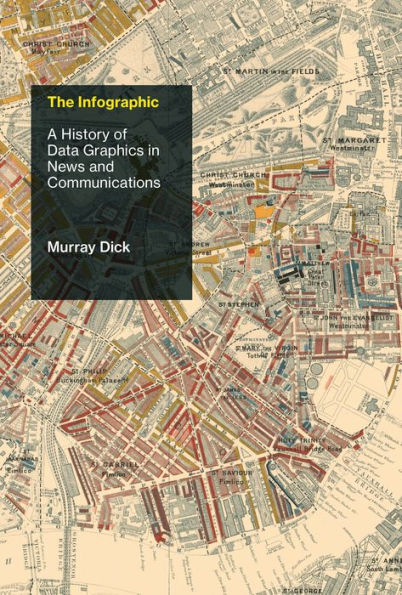
The Infographic: A History of Data Graphics in News and Communications
An exploration of infographics and data visualization as a cultural phenomenon, from eighteenth-century print culture to today's data journalism.

Infographics and data visualization are ubiquitous in our everyday media diet, particularly in news—in print newspapers, on television news, and online. It has been argued that infographics are changing what it means to be literate in the twenty-first century—and even that they harmonize uniquely with human cognition. In this first serious exploration of the subject, Murray Dick traces the cultural evolution of the infographic, examining its use in news—and resistance to its use—from eighteenth-century print culture to today's data journalism. He identifies six historical phases of infographics in popular culture: the proto-infographic, the classical, the improving, the commercial, the ideological, and the professional.

Dick describes the emergence of infographic forms within a wider history of journalism, culture, and communications, focusing his analysis on the UK. He considers their use in the partisan British journalism of late eighteenth and early nineteenth-century print media; their later deployment as a vehicle for reform and improvement; their mass-market debut in the twentieth century as a means of explanation (and sometimes propaganda); and their use for both ideological and professional purposes in the post–World War II marketized newspaper culture. Finally, he proposes best practices for news infographics and defends infographics and data visualization against a range of criticism. Dick offers not only a history of how the public has experienced and understood the infographic, but also an account of what data visualization can tell us about the past.

1133598070
The Infographic: A History of Data Graphics in News and Communications
An exploration of infographics and data visualization as a cultural phenomenon, from eighteenth-century print culture to today's data journalism.

Infographics and data visualization are ubiquitous in our everyday media diet, particularly in news—in print newspapers, on television news, and online. It has been argued that infographics are changing what it means to be literate in the twenty-first century—and even that they harmonize uniquely with human cognition. In this first serious exploration of the subject, Murray Dick traces the cultural evolution of the infographic, examining its use in news—and resistance to its use—from eighteenth-century print culture to today's data journalism. He identifies six historical phases of infographics in popular culture: the proto-infographic, the classical, the improving, the commercial, the ideological, and the professional.

Dick describes the emergence of infographic forms within a wider history of journalism, culture, and communications, focusing his analysis on the UK. He considers their use in the partisan British journalism of late eighteenth and early nineteenth-century print media; their later deployment as a vehicle for reform and improvement; their mass-market debut in the twentieth century as a means of explanation (and sometimes propaganda); and their use for both ideological and professional purposes in the post–World War II marketized newspaper culture. Finally, he proposes best practices for news infographics and defends infographics and data visualization against a range of criticism. Dick offers not only a history of how the public has experienced and understood the infographic, but also an account of what data visualization can tell us about the past.

20.99 In Stock
The Infographic: A History of Data Graphics in News and Communications

The Infographic: A History of Data Graphics in News and Communications

by Murray Dick
The Infographic: A History of Data Graphics in News and Communications

The Infographic: A History of Data Graphics in News and Communications

by Murray Dick

eBook

$20.99 

Available on Compatible NOOK devices, the free NOOK App and in My Digital Library.
WANT A NOOK?  Explore Now

Related collections and offers


Overview

An exploration of infographics and data visualization as a cultural phenomenon, from eighteenth-century print culture to today's data journalism.

Infographics and data visualization are ubiquitous in our everyday media diet, particularly in news—in print newspapers, on television news, and online. It has been argued that infographics are changing what it means to be literate in the twenty-first century—and even that they harmonize uniquely with human cognition. In this first serious exploration of the subject, Murray Dick traces the cultural evolution of the infographic, examining its use in news—and resistance to its use—from eighteenth-century print culture to today's data journalism. He identifies six historical phases of infographics in popular culture: the proto-infographic, the classical, the improving, the commercial, the ideological, and the professional.

Dick describes the emergence of infographic forms within a wider history of journalism, culture, and communications, focusing his analysis on the UK. He considers their use in the partisan British journalism of late eighteenth and early nineteenth-century print media; their later deployment as a vehicle for reform and improvement; their mass-market debut in the twentieth century as a means of explanation (and sometimes propaganda); and their use for both ideological and professional purposes in the post–World War II marketized newspaper culture. Finally, he proposes best practices for news infographics and defends infographics and data visualization against a range of criticism. Dick offers not only a history of how the public has experienced and understood the infographic, but also an account of what data visualization can tell us about the past.


Product Details

ISBN-13: 9780262358125
Publisher: MIT Press
Publication date: 04/21/2020
Series: History and Foundations of Information Science
Sold by: Penguin Random House Publisher Services
Format: eBook
Pages: 248
File size: 58 MB
Note: This product may take a few minutes to download.
Age Range: 18 Years

Table of Contents

Acknowledgments ix

1 Introduction 1

2 Confronting the "Chaos of Being": The Politics of Visual Knowledge 31

3 "Arts for Attracting Public Attention": The Improving Infographic 63

4 "Wider Still and Wider, Shall Thy Bounds Be Set": Empire and Anxiety at the Fin de Siècle 97

5 Propagandist, Professional, Processor: The Rise of the Visual journalist 139

6 Conclusion 167

Notes 389

References 201

Index 225

What People are Saying About This

From the Publisher

Murray Dick presents a widened context for understanding how data visualizations attract attention and spur action in the public sphere. Students of statistical graphics will find The Infographic a welcome addition to the writings of Bertin, Foucault, and Tufte.

Mark Monmonier, Distinguished Professor of Geography, Syracuse University; author of How to Lie with Maps and editor of Cartography in the Twentieth Century

This book is an eloquent integration of both audience and practitioner into the long gestation of data visualization as a key element in journalism's history. In inviting us to consider the urgent questions around our present engagements with technology, Dick provides us with a cumulative, social interpretation of such visualizations.

Martin Conboy, Professor of Journalism History, University of Sheffield, UK

The Infographic by Murray Dick is a must for everybody concerned with the history of communication, media, and visual culture. While other writers situated data visualization within histories of science and statistics, The Infographic is the first to look at its development within news culture, from the 18th century to today. The book will also benefit data visualization practitioners and everybody working in news media.

Dr. Lev Manovich, Professor of Computer Science, The Graduate Center, City University of New York, Director of the Cultural Analytics Lab

From the B&N Reads Blog

Customer Reviews