As If By Magic: An Exclusive Guest Post from MinaLima, the Team that Designs and Illustrates the MinaLima Edition of Harry Potter and the Prisoner of Azkaban
Hardcover $39.99
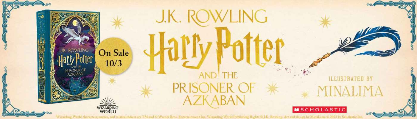
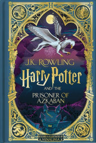
Harry Potter and the Prisoner of Azkaban: MinaLima Edition (Harry Potter Series #3)
Harry Potter and the Prisoner of Azkaban: MinaLima Edition (Harry Potter Series #3)
By
J. K. Rowling
Illustrator
MinaLima Design
In Stock Online
Hardcover $39.99
The illustrated Harry Potter series continues to wow, with art from the graphic masterminds of the Wizarding World, MinaLima. Rediscover the magic of Sirius Black and his escape from Azkaban alongside sensational artistic renderings. Keep reading for a Q&A with Miraphora and Eduardo, the designers behind this stunning edition.
The illustrated Harry Potter series continues to wow, with art from the graphic masterminds of the Wizarding World, MinaLima. Rediscover the magic of Sirius Black and his escape from Azkaban alongside sensational artistic renderings. Keep reading for a Q&A with Miraphora and Eduardo, the designers behind this stunning edition.
Miraphora and Eduardo, how long have you been working together and how were you introduced to the Wizarding World?
Miraphora: I was invited by Stuart Craig (the legendary Production Designer!) to join his team when he commenced work on Harry Potter and The Philosopher’s Stone. We had just completed a film together and had already worked together on a number of films previously. So I kind of just fell — apparated, even! — into the Wizarding World, as if by magic. To be perfectly honest, none of us really knew who Harry Potter even was at the start because it wasn’t yet quite the phenomenon it became soon after. That first job in 2000 was only supposed to be for 4 months. Eduardo joined me on the set of the second Harry Potter film and we have been working together ever since – 22 years ago!
Prisoner of Azkaban introduces some exciting new characters. Which one was your favourite to illustrate and why?
Eduardo: Definitely, Trelawney. The great thing about designing and illustrating a book is that we get to construct the whole world instead of creating only the graphic props, as we do for the films. So, we got to think about Trelawney’s classroom in Hogwarts and how it might feel for the students to be in there. There was a very strong aesthetic. We have this little saying that if you can smell and hear a drawing beyond just seeing it, then we’ve done our job right. In our illustration of Trelawney’s classroom, you can feel that it is hot and musty… and the air is a bit thick with the burning incense.
You designed the graphic props for all the Harry Potter movies including the Marauder’s Map. How did you approach creating a new map design for this book?
Miraphora: It was actually very important for us that the visual interpretations, unless they were really heavily described in the book, should not look like the films, because this was a new interpretation. We would only keep to things that were mentioned in the story, for example if someone’s hair was a particular colour, we would honour that, and so with the Marauder’s Map, we have kept the green ink and the square shape.
When we designed this prop in the film, we wanted to ensure there was a sense of mystery and intrigue, we evoked the idea that there were layers to discover, but obviously the physical restrictions of designing a book are very different to those for a film. With a book you only have six inches to work within, which is a whole different ball game. So really, we’re just giving a snapshot of something magical and hopefully your imagination will fill the rest.
Which interactive insert was the most fun to design and why?
Eduardo: This question is always a bit difficult because we love everything that makes it into the final book, but a special mention must definitely go to The Monster Book of Monsters. Whenever we think about ordinary objects that have been made magical, we believe that they should always maintain their original purpose. So, for example, the howler should look more like a letter than a screaming face and the Monster Book of Monsters should look more like a book than a monster. But we use its essential design elements to bring to life the role that it’s playing: with the howler, the ribbon becomes the tongue, and, in this book, what looks like the guts of the monster is actually marbled paper (which is quite common to have in a book).
Are there any special “easter eggs” in the illustrations that you can share?
Miraphora: You’ll have to buy the book to find out! Somewhere in Chapter 3 there may or may not be an easter egg that involves a moving vehicle and some innocent passengers..!
Can you elaborate on why Prisoner of Azkaban is your favorite Harry Potter book?
Miraphora and Eduardo: We’re particularly excited about everyone seeing this book because we know it’s a fan favorite. The plot takes a darker turn than the first two books, and there is suddenly more contrast between the often scary depth in storyline and the childish innocence of the characters who are all, in fact, still very young. As illustrators, that’s an interesting invitation to create, as the more layers and more drama in the writing, the more drama in the visuals.