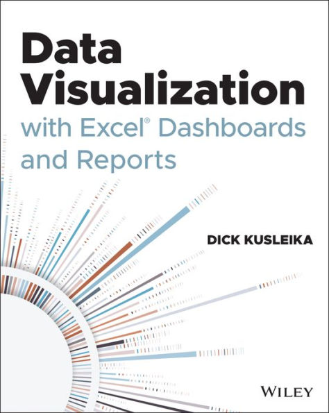
Most Excel books do a nice job discussing the individual functions and tools that can be used to create an "Excel Report". Titles on Excel charts, Excel pivot tables, and other books that focus on "Tips and Tricks" are useful in their own right; however they don't hit the mark for most data analysts. The primary reason these titles miss the mark is they are too focused on the mechanical aspects of building a chart, creating a pivot table, or other functionality. They don't offer these topics in the broader picture by showing how to present and report data in the most effective way.
What are the most meaningful ways to show trending? How do you show relationships in data? When is showing variances more valuable than showing actual data values? How do you deal with outliers? How do you bucket data in the most meaningful way? How do you show impossible amounts of data without inundating your audience? In Data Visualization with Excel Reports and Dashboards, readers will get answers to all of these questions. Part technical manual, part analytical guidebook; this title will help Excel users go from reporting data with simple tables full of dull numbers, to creating hi-impact reports and dashboards that will wow management both visually and substantively. This book offers a comprehensive review of a wide array of technical and analytical concepts that will help users create meaningful reports and dashboards.
After reading this book, the reader will be able to:
- Analyze large amounts of data and report their data in a meaningful way
- Get better visibility into data from different perspectives
- Quickly slice data into various views on the fly
- Automate redundant reporting and analyses
- Create impressive dashboards and What-If analyses
- Understand the fundamentals of effective visualization
- Visualize performance comparisons
- Visualize changes and trends over time

Data Visualization with Excel Dashboards and Reports
352
Data Visualization with Excel Dashboards and Reports
352
Product Details
| ISBN-13: | 9781119698722 |
|---|---|
| Publisher: | Wiley |
| Publication date: | 02/17/2021 |
| Pages: | 352 |
| Product dimensions: | 7.30(w) x 9.10(h) x 0.90(d) |

